Above is another painting I recently did that turned out really cool.
What did I do and why?
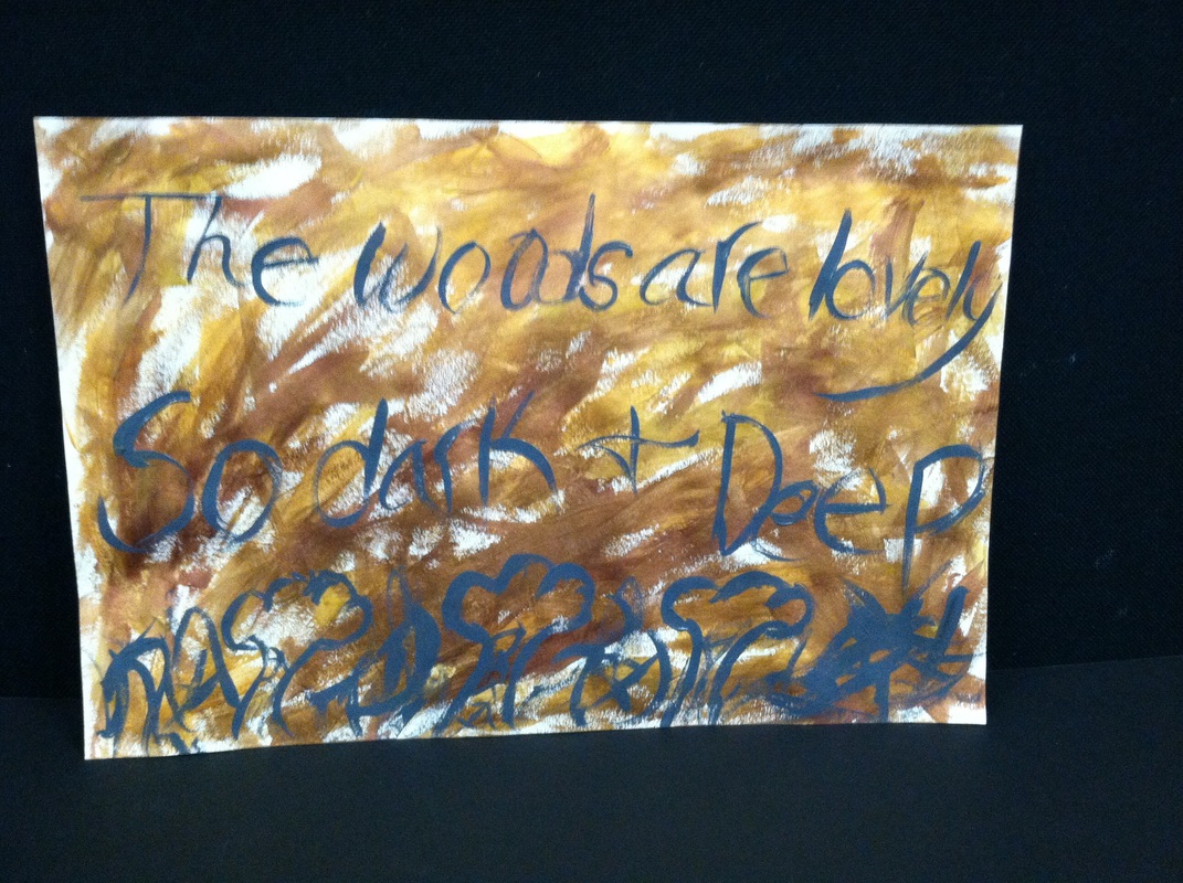
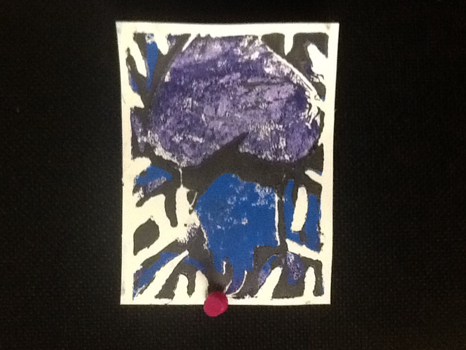
First of all, I honestly didn't think this would become anything. I just thought that I had some extra time at the end of class and I'd play around and see what happens. As I started playing around with the different metallic bronzes and golds and swirling them as well, I thought that this would be kind of cool to make something out of. I hopped onto the internet and found a Robert Frost quote that I really liked. However I just took two parts from different parts of the poem and just mixed them together to come up worth he words, "The woods are lovely, so dark and deep." I feel like that quote goes well with the style of the streaks of mixed and metallic paint. Even though only one color of the paint is dark, in my person opinion, the golds give off that vibe too, though I could not tell you why. I did the trees at the bottom and the streaks of grey around it to really show the darkness of the woods; the tress themselves, because the quote was talking about the woods and trees are typically pretty common in the woods. I really like the kind of flowy font, I guess I could say, that I used for the quote. I think it gives off that eerie vibe a little that I was trying to go for. I think hat even though it wasn't originally going to be anything, I think it turned out nicely and seems like it was going to be that, destined to be that, from the beginning.
First of all, I honestly didn't think this would become anything. I just thought that I had some extra time at the end of class and I'd play around and see what happens. As I started playing around with the different metallic bronzes and golds and swirling them as well, I thought that this would be kind of cool to make something out of. I hopped onto the internet and found a Robert Frost quote that I really liked. However I just took two parts from different parts of the poem and just mixed them together to come up worth he words, "The woods are lovely, so dark and deep." I feel like that quote goes well with the style of the streaks of mixed and metallic paint. Even though only one color of the paint is dark, in my person opinion, the golds give off that vibe too, though I could not tell you why. I did the trees at the bottom and the streaks of grey around it to really show the darkness of the woods; the tress themselves, because the quote was talking about the woods and trees are typically pretty common in the woods. I really like the kind of flowy font, I guess I could say, that I used for the quote. I think it gives off that eerie vibe a little that I was trying to go for. I think hat even though it wasn't originally going to be anything, I think it turned out nicely and seems like it was going to be that, destined to be that, from the beginning.


 RSS Feed